
Shop Moringa
Services Rendered:
Brand Name | Logo & Tagline | Copywriting | Brand Story | Brand Clarification & Refinement | Collection Development | Jewelry & Accessory Design | Merchandising Plan | White-box Product, Studio Product, and Location Look Book Photoshoots | Marketing Materials | Social Media Strategy | Design & Merchandising Calendar
Phase 1- Choosing the Name & Logo
When MORINGA approached me they were operating under another name, had no collection focus, and needed to launch their rebrand quickly. In 2 months we were able to take the affiliate website they had been using to a new brand standard and create the initial name, logo, and tagline. I gave the business owners a few names to choose from that all reflected Ethiopia or Africa, where their products were being made while remaining flexible in case the business decided to expand to other countries. We felt the imagery of the moringa tree was poignant to the reason the business was started. The moringa tree provides medicine and food and grows quickly and sustainably in tropical areas that tend to struggle with poverty. It is a life-giving tree to those who need it most. When running a market research study I found the moringa supplement was rising in popularity. We felt this would only further help the brand to connect with the health-conscious community who also tend to value ethical products.


The logo package included a full-unit logo with an icon, and a stacked logo with an icon, where the icon could be separated out and used for product branding.
The graphic designer and I wanted the logo to reflect the community aspect of the brand (shown in the crossed M, like hands holding), a clean and modern yet approachable aesthetic (shown in the open spaces that feel inviting such as the G and the A), and an open call for others to join in with the brand’s community (shown in the open A that is shaped like a tent or open door). The Icon “M” also reflects the mountain range where many of the makers were from.
I came up with the tagline "Designing a World of Opportunity" to focus first on the brand as a fashion company that is design focused and second on the brand’s ethos of providing an opportunity to those who are in poverty.


Phase 2- Collection Refinement & Creation
For the launch, we didn’t have time to create new designs and many of their back-stock jewelry pieces were random and did not have a cohesive feel. I first started by weeding out products that didn't fit the style of the new direction. Next, I separated these into collections so shoppers could easily find a bracelet or earrings to match the necklace they were purchasing.


Phase 3- Visual Identity
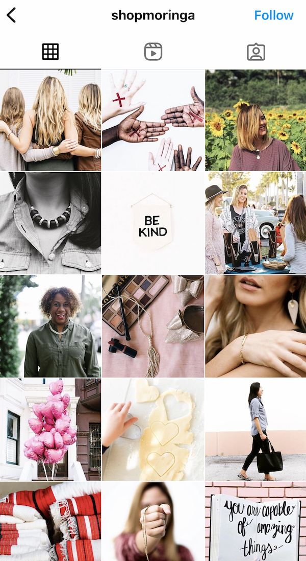
I produced a series of photoshoots for web, social, and catalog, that had a clean and more sophisticated feel than the previous site and was aimed at women aged 35-55 in their current market in Montana. The client wanted feminine, sophisticated, and approachable images. A feel that was somewhere in between the simplicity of Eileen Fisher and the beauty of Anthropology. We had a great team to make this happen including Kelsey Wilson Photography, Tiffany S. H/MUA, Neva R. Photo Assistant, and Angela-Page Parks Models. We shot this at a photo studio in the design district in Dallas.


We launched on time and on budget,
which included a full lookbook that you can see here.
Phase 4- Brand Guidelines
Normally I like to have the brand guidelines established first, but in this case, we were able to set some critical groundwork with the logo and visual identity for the fast launch. Because the brand’s name is based on a tree, graphic designer Sarah D. and I worked to creatively split the brand guidelines book into sections that included “The Roots”, “The Trunk”, “The Branches”, “The Leaves”, and “The Seeds”. This book encompassed all areas surrounding the brand including logo, color standards, font package, brand identity, packaging, target market, visual standards, and a basic timeline for the brand’s growth goals.


Phase 5- New Products
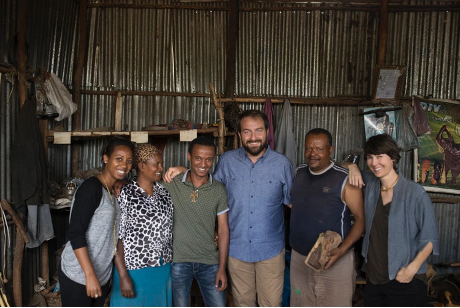
The brand wanted to continue to dive into jewelry and handbags made in Ethiopia. Since I was experienced in jewelry design, the next phase was choosing the right handbag designer to fit the brand’s target market and design aesthetic. Corie H., formerly of Skagen, joined me in Ethiopia for a month of sourcing materials and designing. Our design sense is very similar and we worked seamlessly off one another's ideas to produce pieces that were perfect for our respective departments. I had been designing jewelry in Ethiopia since 2008 and much of the jewelry coming out of Ethiopia tends to look the same. I knew I had to find some new materials to incorporate into the product design. The business owners were aiming for a higher price point item so I focused on seeking out some unique materials (ebony wood), while Corie focused on developing specially dyed and finished leathers with superb finishing. Each design included a final sample and tech pack/spec sheet for the artisans to reference. We also trained the managers to rely on quality control checkpoints before shipping. In all my years of working there, I felt so proud that we were able to come up with a truly unique product that celebrated the culture and natural elements of the country of origin while remaining true to the western design aesthetic. Here are a hand full of examples of the work we did:


Phase 6- Marketing Materials
Before the new product launch began MORINGA needed printed materials to include with each piece. I worked with graphic designer Kayla D. and copywriter Kelsey K. to make these beautiful product cards that reflected the modern elegance of the brand while telling the story behind each product.


Phase 7- Social Media Strategy
I worked closely with Tianna C. from Social Cake to get them all the information we had put together so her team could craft a successful social strategy. This included best practices, posting schedules, and ways to reach out to their target audience.


Phase 8- Merchandising & Design Calendar
Getting MORINGA on a production and design calendar was of utmost importance to insure that orders would be delivered on time. I worked with social media, the owners, and the artisan groups to create a timeline to get them started. These calendars change from year to year but we knew there were some key dates we needed to hit, including some wholesale markets. After dropping those dates on the calendar, we were able to build everything else around that.

I am so happy about what we were able to accomplish in the span of a year. While there is still a lot of work to be done, MORINGA now has a solid foundation to move forward. Thank you to MORINGA for the opportunity to be part of this launch, and thank you to my coast-to-coast team for all your hard work in making this branding feat a success!
UPDATE: MORINGA went through some personal challenges and after a year in business had to dissolve the brand back into their non-profit “My Fight”. Moringa products are still sold here.